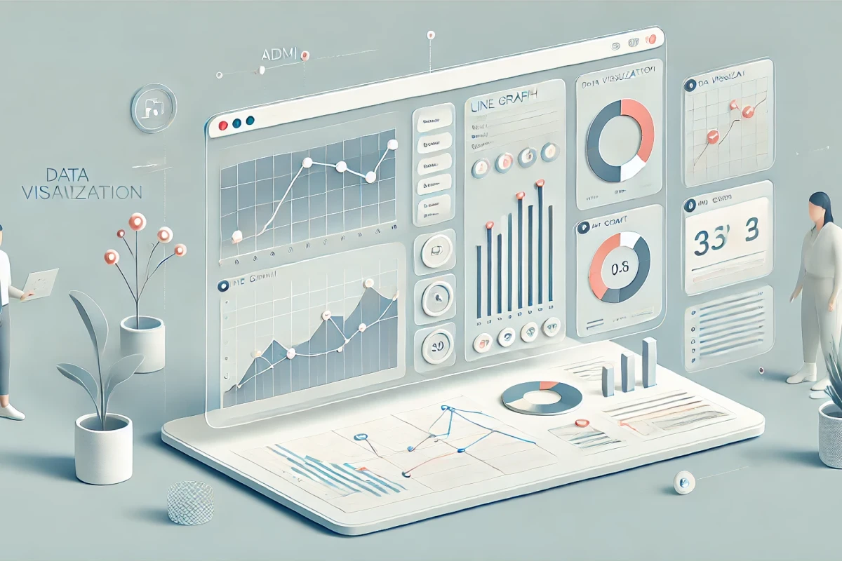
Data Visualization in the Admin Panel

How to Create a Clear Picture for Every Employee
In the modern business world, where the amount of data is growing every day, it's not only important to have access to data, but also to be able to understand it quickly. This is where data visualization comes in: when numbers and tables are transformed into understandable charts, graphs, and infographics, even the dullest reports come to life, and the decision-making process becomes much faster. How do you create such an admin panel so that every employee gets a clear and understandable picture of their work? Let's look at some tips and best practices!
1. The Importance of Visualization: Graphs Instead of Numbers
📊 Problem: For many employees, a large number of numbers in tables is difficult to analyze quickly. When you have to draw conclusions from numerous rows and columns, the process becomes unpleasant and sometimes completely incomprehensible.
Solution: Convert the data into understandable charts—bar charts, line charts, or pie charts. For example, if you have a monthly report on sales figures, a bar chart can show the daily dynamics. This representation allows you to immediately see which days were particularly successful and which need more attention. Less numbers, more understanding!
2. Filters and Segmentation: The Information You Need in a Few Clicks
🗂️ Problem: Not every employee needs access to all the data at once. For example, the sales department is more interested in sales per customer, while the project manager focuses on the status of task completion. If everyone is looking at the same chart, the picture becomes less clear.
Solution: Add the ability to apply filters and segments. For example, you can filter out data for a specific customer or project. This saves time, helps avoid mistakes, and allows each person to see what is relevant to them.
3. Types of Charts: Choose Wisely
🖼️ Problem: Sometimes, every report turns into a pie chart, even when it’s not the best choice. As a result, the information becomes harder to understand and grasp.
Solution: The choice of chart should depend on the goal. Here are some examples:
- Pie charts – to show proportions, but no more than five to seven elements.
- Line charts – to show dynamics, especially over time.
- Scatter plots – when showing the correlation between two variables.
A well-chosen chart saves more time than a one-hour report with a hundred rows!
4. Color Accents: Minimalism in Action
🌈 Problem: Too many colors can confuse users and distract from the most important metrics.
Solution: Use color accents sparingly. For example, green can be used to highlight growth, red for decline, and gray for neutral metrics. Remember: the fewer the colors, the less visual clutter, and the more the user focuses on what matters.
5. Simple and Intuitive Interface: Let Intuition Work for You
🖥️ Problem: A cluttered interface creates a sense of chaos and confusion.
Solution: The interface should be minimalist and intuitive. Add simple labels for each chart and tool, clear tooltips, and brief explanations. Implement "breadcrumbs" or indicators to help users quickly navigate the interface.
6. Interactivity: From Basic Data to In-Depth Analysis
🔍 Problem: Sometimes the information on the surface is only part of the picture, and deeper data is needed for a thorough analysis.
Solution: Add interactivity, such as the ability to hover over a data point for more information or click on a chart element to see a detailed view. This functionality allows users to easily transition from an overview to more specific data and conduct a deeper analysis.
7. Regular Data Updates: Keeping the Picture Current
⏳ Problem: Outdated data is not only useless but can also mislead and lead to wrong decisions.
Solution: Ensure automatic data updates in real-time or at regular intervals. This gives employees access to up-to-date information at all times. For example, daily performance updates or weekly sales reports help employees stay connected with their ongoing tasks.
Summary: Visualization is the key to efficiency. A user-friendly admin panel with data visualization allows every employee to quickly and effectively analyze information, find the data they need, and understand the big picture. Professionally selected charts, an intuitive interface, and regular updates help create an efficient environment where every user appreciates working with the admin panel.

